Most companies do not lack data — they lack one page that shows what is going on. A good Power BI dashboard turns exports, spreadsheets and CRM data into a handful of numbers people check every morning. A bad one becomes a wall of charts nobody opens after the first week.
Below are four Power BI dashboard examples that work for almost any business: sales, finance, marketing and operations. For each one you will find the questions it answers, the KPIs to put at the top, the data it needs and a layout you can reuse. The layouts are illustrations we drew to show the structure — your own numbers will replace them.
Report or dashboard: what's the difference?
In Power BI, a report is one or more interactive pages built from a data model, with filters and slicers you can click. A dashboard is a single page in the Power BI service where you pin tiles from one or more reports; it is made for monitoring and has far fewer interactive features. Most "dashboards" companies ask for are really report pages, and that's what the examples below describe.
What every good dashboard has in common
Before the examples, the rules that make the difference between a dashboard people use and one they ignore:
- One audience, one purpose. A sales director and an accountant need different pages. Mixing them makes both worse.
- Four or five numbers at the top. The KPIs that answer "are we on track?" — big, clear, compared with a target or last period.
- Detail below, not instead. One or two charts that explain the KPIs: trend over time, breakdown by product, region or channel.
- It refreshes on its own. A dashboard that someone must update by hand every Monday will be out of date by Wednesday.
- It is fast. If a page takes ten seconds to load, people stop opening it. Clean data models matter more than fancy visuals.
1. Sales dashboard
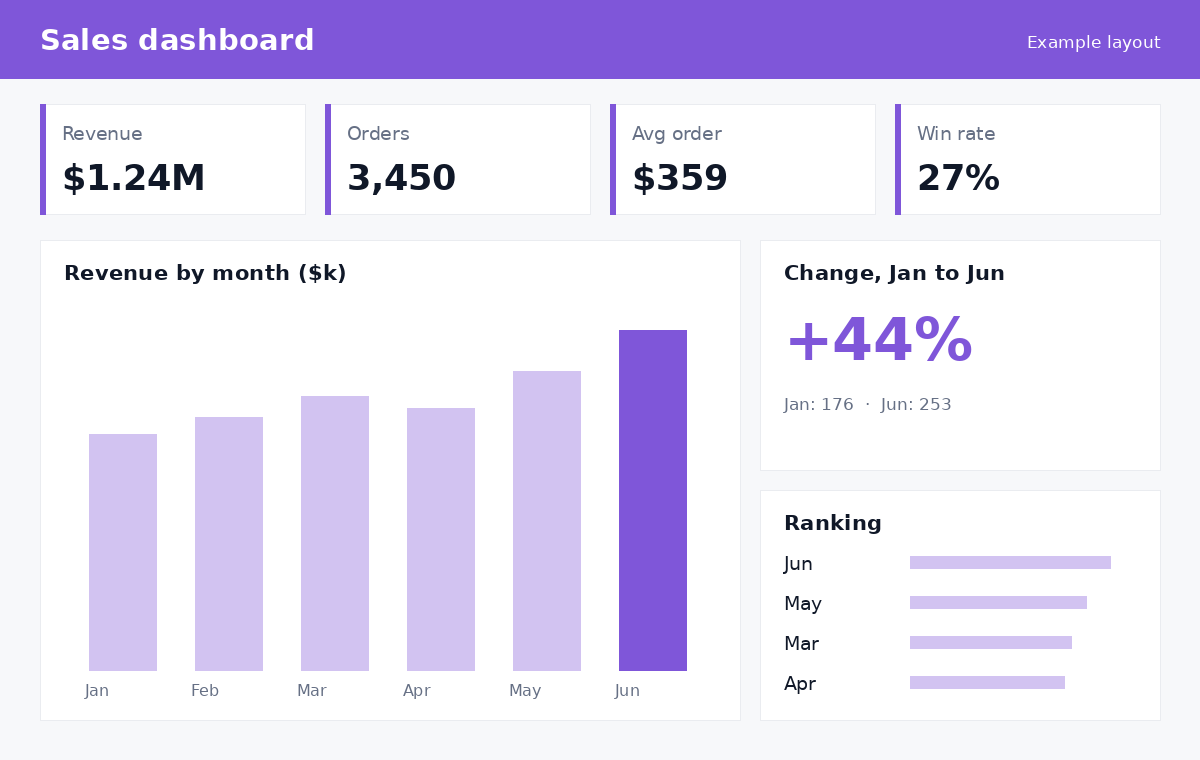
Example layout: KPIs at the top, revenue by month, trend and best months.
Questions it answers: Are we hitting our revenue target this month? Which products, regions or reps drive the results? Is the pipeline big enough for next quarter?
KPIs at the top: revenue (vs target), number of orders, average order value, win rate.
Data it needs: your CRM (HubSpot, Salesforce, Pipedrive) for deals and pipeline, and your billing or e-commerce system for actual revenue. Joining the two is usually the first real piece of work — they rarely use the same customer names.
Tip: show the pipeline next to revenue. Revenue tells you what happened; pipeline tells you what is about to happen.
2. Finance dashboard
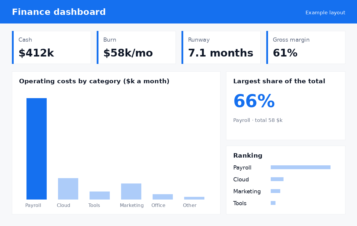
Example layout: cash position, monthly burn, runway and where the money goes.
Questions it answers: How much cash do we have and for how long? Where does the money go? Are margins holding?
KPIs at the top: cash, monthly burn, runway in months, gross margin.
Data it needs: your accounting software (QuickBooks, Xero, Sage), bank exports, and sometimes payroll. Categories must be consistent across months, which is why a short cleaning step pays off.
Tip: finance dashboards are read by few people but trusted by everyone. Add a small "last refreshed" date and a link to the source report so numbers can always be checked.
3. Marketing dashboard
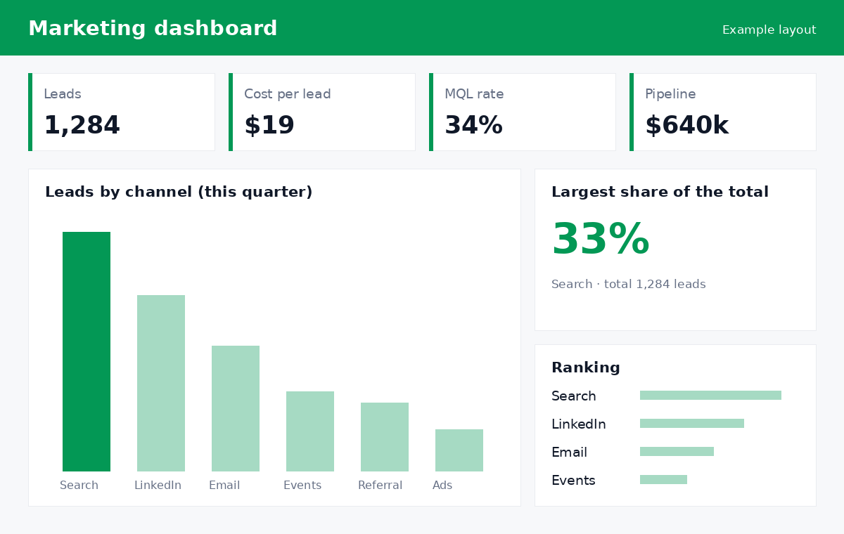
Example layout: leads, cost per lead, qualification rate and pipeline, broken down by channel.
Questions it answers: Which channels bring leads that turn into customers — not just clicks? What does a lead cost? Is marketing feeding the sales pipeline?
KPIs at the top: leads, cost per lead, lead-to-qualified rate, pipeline generated.
Data it needs: ad platforms (Google Ads, LinkedIn), your website analytics, email tool and CRM. The valuable part is connecting a lead's source to what happened later in the CRM — that is what tells you where to spend.
Tip: rank channels by pipeline or revenue, not by number of leads. Cheap leads that never buy look great on a leads-only chart.
4. Operations dashboard
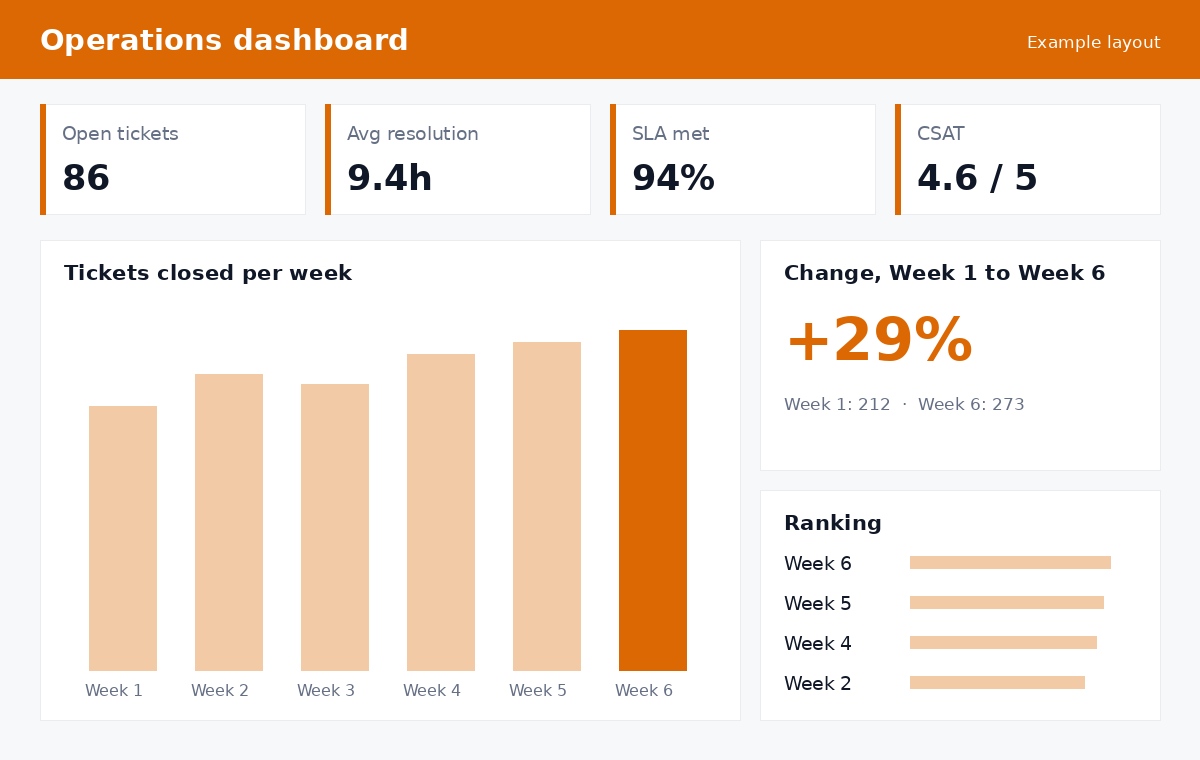
Example layout: workload, speed, service level and customer satisfaction, week by week.
Questions it answers: Are we keeping up with demand? Are customers waiting too long? Is quality holding as volume grows?
KPIs at the top: open tickets or orders, average resolution or delivery time, share within SLA, customer satisfaction.
Data it needs: your help desk (Zendesk, Freshdesk), project or order system, and survey results. Weekly views work better than daily ones here — they smooth out noise and show real trends.
Tip: add a simple alert rule (for example, SLA below 90%) so the dashboard tells you when to look, instead of you checking it all day.
Five mistakes that make dashboards fail
Most dashboards that end up unused fail for the same few reasons:
- Building before asking. Start with the three questions the reader needs answered every week, not with the data you happen to have.
- Too many visuals on one page. Twelve charts look impressive in a demo and confuse everyone afterwards. Split by audience instead.
- No definition of the numbers. If sales and finance count "revenue" differently, the dashboard starts an argument instead of ending one. Write each KPI's definition in a tooltip or a small notes page.
- Manual steps in the refresh. Every copy-paste is a future error. Connect sources directly and schedule the refresh.
- Nobody owns it. Name one person who checks the numbers after each change and decides what goes on the page. Dashboards without an owner slowly drift out of date.
How much does a Power BI dashboard cost?
The price depends far less on the number of charts than on the state of your data. Connecting one clean source is quick; combining four tools with different customer IDs, then cleaning and modeling the result, is where the time goes.
Specialists usually price this work as fixed-scope packages. As a guide, these are the starting points RemoteAI suggests to its data specialists for dashboard projects:
| Scope | Typical content | Suggested starting price on RemoteAI |
|---|---|---|
| Essential | 1 data source, up to 5 charts, video hand-over | from about $150 |
| Standard | Up to 3 data sources, data cleaning and model, automatic refresh | from about $400 |
| Premium | Up to 6 data sources, filters and views per team, 2 weeks of support | from about $900 |
These are starting prices for packaged services with a fixed scope. A custom project usually costs more: on our page for Power BI developers, a typical dashboard design and build runs $2,000–$8,000, and a full reporting suite $8,000–$35,000. The gap comes from the number of sources, the data cleaning and how many teams use the result.
Licenses are separate. To share a dashboard, you and the people who view it usually need a Power BI Pro (or Premium Per User) license. Free users can only view shared content when it sits in a Premium P capacity or a Fabric capacity of F64 or larger; smaller F capacities still require Pro, according to Microsoft's sharing documentation. Check Microsoft's current Power BI pricing for your team size.
The skills behind a good Power BI dashboard
The skills behind a good Power BI dashboard are mostly data skills: Power BI itself is the easy part. What makes a dashboard reliable is everything around it: getting data out of your tools, cleaning it and modeling it so the numbers are right. That shows in the profiles of the Power BI experts on RemoteAI — most of them also work with SQL and Python:
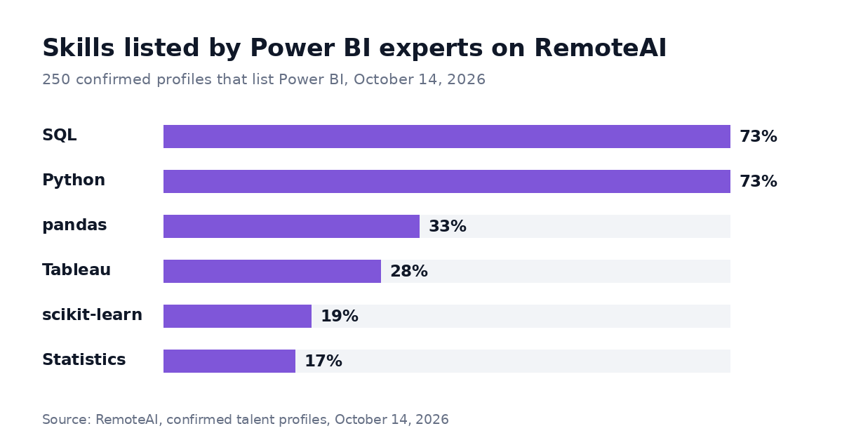
Method: all 250 confirmed talent profiles on RemoteAI that list Power BI as a skill, counted on October 14, 2026; each share is the number of those profiles that also list the skill. Profiles are self-declared and reviewed by our team.
When you hire, ask to see one dashboard they built and one data problem they solved behind it — for example, matching customers across two systems, such as a CRM and an invoicing tool, or a model that made a slow report fast. Someone who can explain the data work will build you a dashboard that stays right.
Build it or have it built
If your data lives in one tool and you have a few hours to learn, start with the sales or operations example above and keep it small. If your numbers are spread across several systems, or the dashboard will drive real decisions, a specialist who has built similar models usually gets there faster, and leaves you a data model you can check.
Find a Power BI developer on RemoteAI, see AI and data analysis experts, compare other AI specialists, or post your project and let experts come to you. Interested in automating more of your business? Read our guide to the AI receptionist for small business.
The short version
Pick one audience, put four or five numbers at the top, explain them with one or two charts, and make it refresh by itself. Start with the dashboard that answers the question you ask most often — sales, finance, marketing or operations — and grow from there.
Sources: Microsoft Power BI pricing, checked October 13, 2026; Microsoft Learn, Share Power BI reports and dashboards and Introduction to dashboards, checked October 14, 2026. RemoteAI suggested starting prices and the project ranges on our Power BI developers page, October 2026.